One of the most pervasive criticisms about variable renewable energy sources like solar and wind is that, since the sun sets at night and the wind doesn’t always blow, we need to back them up with generation like natural gas and coal. As a result, you have a perverse situation where the installation of these zero-carbon sources can actually increase greenhouse gas emissions — the exact thing we were trying to avoid! One of the classic examples is that, as a result of shutting down nuclear power plants and installing too much renewable energy, Europe has had to increase the generation of coal and natural gas to backup the unreliable wind turbines and solar panels, and as a result greenhouse gases have actually risen. It’s a tragedy, right?
The problem with what I have just described, however, is that it is not true. But you certainly wouldn’t know that from watching the typical North American media outlets! But forget about the layman reporter, this is even repeated as a given among energy professionals. I hear this all the time in my work, and my voice has gotten coarser over the years making the same rebuttals…
So here I have the first in a series of articles I am calling “Energy Myths Exposed“, and I of course will be spending a lot of time on renewable energy. A lot of these are repeated so often that they have become unquestionable “facts”. But repeating something again and again doesn’t make it true.
If the particular myth of this post were true, we should clearly see an increase in fossil fuel consumption in the energy statistics. But thanks to renowned French energy economics and policy expert Bernard Chabot’s recent compilation of EU energy statistics from the last 23 years, we have some lovely graphs that shine a light on reality. The best part for me is that I don’t even need to do any work myself! Thanks for making it easy Bernard!
Here is what has happened with the electricity system in the EU-28 countries over the last 23 years with data from the European network of transmission operators ENTSO-E:
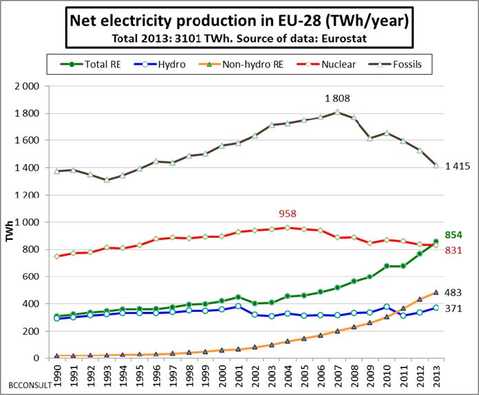
Contrary to popular belief among many energy professionals, fossil fuel emissions peaked in 2007 (top black curve). There was a severe drop from 2007 to 2008 due to the global financial crisis, but even after the economic recovery, fossil fuels have never recovered and are down fully 22%. What has been growing substantially instead is the bottom orange curve, which is mainly wind and solar. I also want to draw your attention to nuclear (red curve), and note that it has decreased 13% since 2004 — so that wasn’t the source picking up the slack.
What this graph shows, unequivocally, is that solar and wind do reduce fossil fuel usage and greenhouse gas emissions. The data is clear, publicly available in the Eurostat database. Bernard Chabot has put it in graphical form that even a child can easily comprehend. Case closed! Now let’s hope belief in this myth goes the way of the vampire and werewolves.
Now some readers will say every region is unique and that the European experience may not be repeatable everywhere. Fair enough. However, it bears noting that the European power system is composed of many different types of individual power systems: Germany has a lot of coal, France has almost all nuclear, Norway is almost all hydro, etc. But even within this very diverse context, we see the above results. So while not universally applicable, it shows very clearly what can be done.
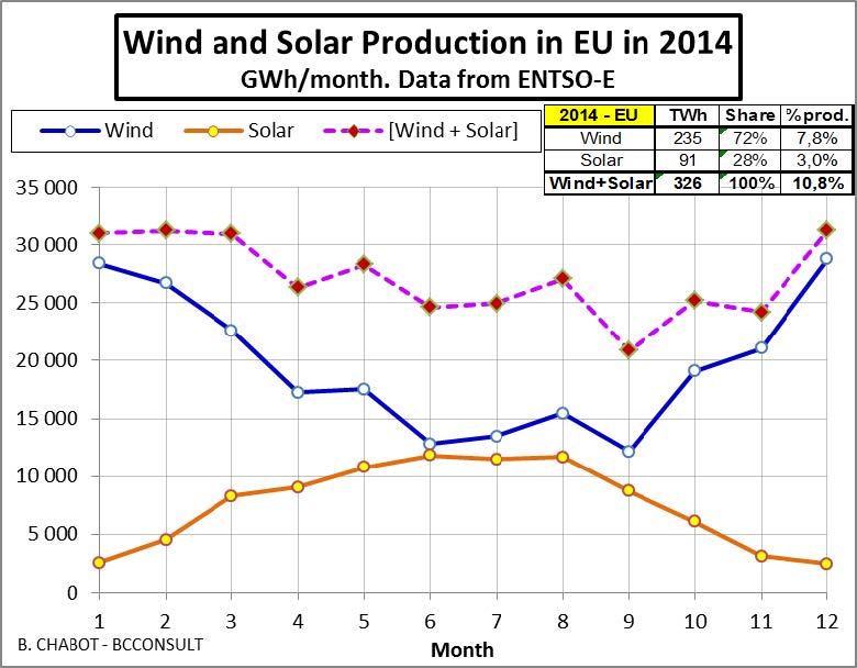
While the main “myth” I have exposed here is on emissions, as part of the opening paragraph there was a passing mention of another myth — the presumed need for total backup for variable energy sources. That topic is enough for an entire other post, so I will not go into it here, but I will note that the same compilation by Bernard also includes a graphic that shows one of the reasons why the backup myth is not true. Wind and solar are distributed technologies, and when the effect of hundreds of thousands of systems all over the place are summed up, we see synergistic effects that are not present when analyzing traditional centralized power plants. One of these effects is that wind and solar actually complement their seasonal variability, with wind picking up solar’s slack in the winter and vice versa. The below graph shows this quite explicitly:
If you would like to see more interesting graphs about energy in the EU over the last 23 years and 2014 in particular, you can download Bernard’s complete study on the Renewables International website, posted by Craig Morris. N.B. There is a good bio of Bernard Chabot on the Paul Gipe website here if you would like to read more about him.
So do you agree with the above? Vehemently disagree? Please comment below as I would love to hear your thoughts. And don’t forget to sign up for the mailing list to get updates!

Thank you for this, very well written and concise. I am interested if there are any country-specific graphs, particularly in Germany where I’ve heard claims that they are increasing coal-fired electricity to fill in the gap left by the nuclear shutdowns.
I would like to point you towards a disturbing study I read recently: http://www.sciencedirect.com/science/article/pii/S0360544213000492
This study (published in a reputable journal) also claims that renewables have a very low energy payback (and therefore increase emissions) due to the need for backup power. I would like to hear your thoughts on this issue.
Please note that some rebuttals to this study has also been published:
http://www.sciencedirect.com/science/article/pii/S0360544214014327
http://www.sciencedirect.com/science/article/pii/S0360544214001601
Christian
Thanks Christian! While it is true that Germany has installed some coal-fired power plant in the last 2 years, this was not a result of the nuclear shutdowns to fill the gap. Those power plants had been approved well before the Fukushima accident and Germany’s reversal on nuclear policy. So that’s another “myth” about renewable energy in Germany that is often repeated in the media as “fact”. Yes, some new coal was installed, but not to fill the gap left by nuclear. But the reality is that coal and natural gas are still DOWN. Here are the stats you are looking for from the German Statistiches Bundesamt:
https://www.destatis.de/EN/FactsFigures/EconomicSectors/Energy/Production/Tables/GrossElectricityProduction.html
2012 to 2014: Coal is down 4%, Natural gas is down 23%, meanwhile the slack has been picked up by 11% more renewable energy. i.e. LOWER emissions!
On the second point you raised, renewable energy having a low energy payback (also , there are some problems applying this concept with renewable energy, and you have listed some rebuttals. One group of researchers has gone as far as proposing a new metric called Energy Yield Ratio (the paper is Permanently dispelling a myth of photovoltaics via the adoption of a new net energy indicator).
Furthermore, it is also a question of economics. Shale oil has a relatively low energy return on energy invested (EROEI), yet was still developed because of high energy prices. Even with the high EROEI of sources like coal and oil, these comparisons are meaningless in the face of needing to address climate change. If we burned all the fossil fuel resources in the ground, the climate would be irrevocably altered beyond measure.
Antonio – great charts. But let me remind you what we all learned in our first probability and statistics course in university. Correlation does not necessarily mean causation. Whether emissions rise or fall when you add renewables depends on 3 major factors: firstly, whether the demand is sufficiently flexible that it can make use of the renewable output when it is available; secondly, whether the power system has access to sufficient amounts of storage to avoid wasting the renewable energy; and thirdly, whether the power system planners are overcommitting renewable capacity to the point where it is displacing capacity of other low emission base-load technologies like hydroelectric or nuclear. Here in Ontario in 2014 we curtailed (dumped) more than 5 TWh of zero emission energy. That is enough energy for 500,000 Ontario homes for a year. In 2020 the Ontario government plans to retire 3,000 MW of nuclear base-load capacity to make room for more renewables with natural gas backup because storage is still to expensive as a backup. The Ministry of Energy has confirmed that carbon dioxide emissions will increase from the electrical grid from about 3.5 million tons a year to over 7 million tons a year after the nuclear units are retired. The data is available on the Ministry web site as appendices to their 2013 Long Term Energy Plan. So whether emissions rise or fall when you add more renewables very much depends on the specific power system you are talking about. If the power system uses a lot of coal, adding renewables almost certainly reduces emissions (Germany, USA, China). However, if the power system uses no coal and very little natural gas, like Ontario’s, reducing capacity of other base-load technologies to accommodate more renewables may very well result in an increase in emissions because more natural gas will be needed for backup until storage becomes much cheaper. The important point here is that a detailed engineering analysis and simulation, of the specific power system being considered, is necessary BEFORE energy policy changes are implemented. Best regards.
I’m glad you enjoyed the charts Paul, and thanks for your insightful commentary! One thing the EU has done right over the years is create a sort-of unified electricity system. You have hydropower in Sweden flowing through Denmark and Germany to the rest of the continent. There was even some discussion years ago about linking North Africa to use cheap solar power from the desert (although that has stalled). In Canada, despite being the same country, the provinces are practically enemies with respect to energy. If we had a better integrated energy system, Ontario could be getting a great deal of its electricity supply from cheap emissions-free hydropower in Quebec and Manitoba. Instead we have this fragmented system across the country, each province following its own path often for only political reasons, and we have perverse situations such as the one you describe. Yes for thorough engineering analyses!
Nice one Antonio!
Maybe next step would be to show that the upward RE trend and downward fossil one lead to an overall reduction of CO2 (which is the whole point, right?), covering the other ‘arguement’ that the smaller fossil portion is not used productively (more units used for peak loads back-up etc.) because of the RE penetration and in the end of the day compromising the CO2 game gain?
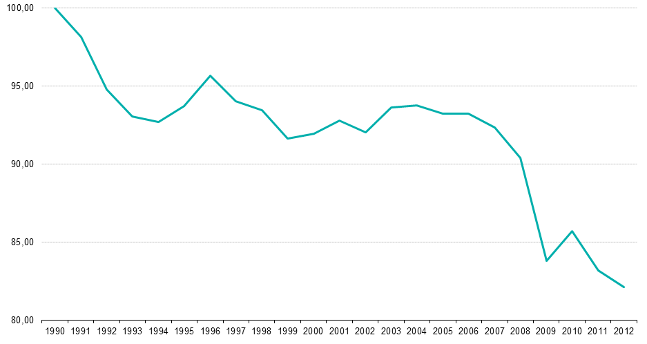
Here it is for Germany: http://www.renewablesinternational.net/german-fossil-fuel-consumption-and-emissions-at-a-record-low/150/407/84356/
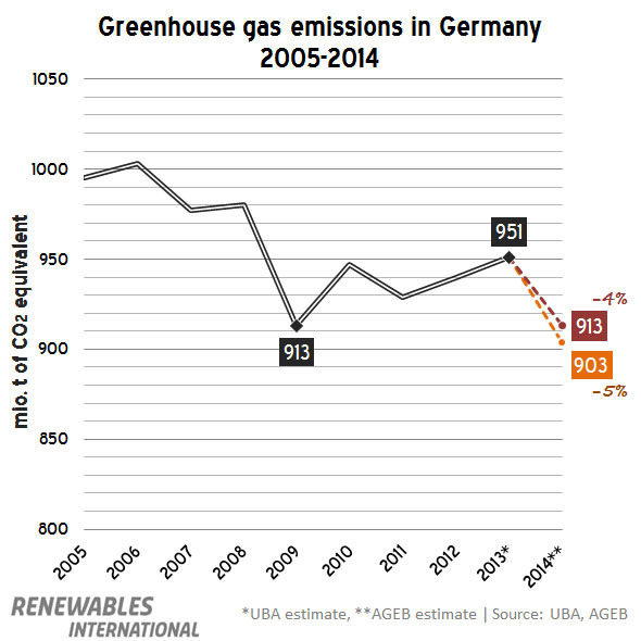
Source: Renewables International
I’ll be back with the EU
Here is the EU (Eurostat data only to 2012): http://ec.europa.eu/eurostat/statistics-explained/index.php/Greenhouse_gas_emission_statistics
Source: Eurostat
You can clearly see the decrease here too.
Nice concise post with clear information dispelling myths. The Internet could use more of this 😉